

Paint Your Success Story and Be Bold with Color
Note! This text exceptionally includes only AI-generated images. The text is lighthearted and suitably colorful ❤ – so take the text and images with humor – we hope you get inspired by the innovative use of colors and the atmosphere AI-generated images bring to spaces!
Each picture includes shade suggestions that best reflect the mood of the image. The purpose of the shade suggestions is to playfully inspire your imagination in using colors differently for choosing colors for walls, paneling, kitchens, hallways, and living rooms!
- Enjoy your reading moments!
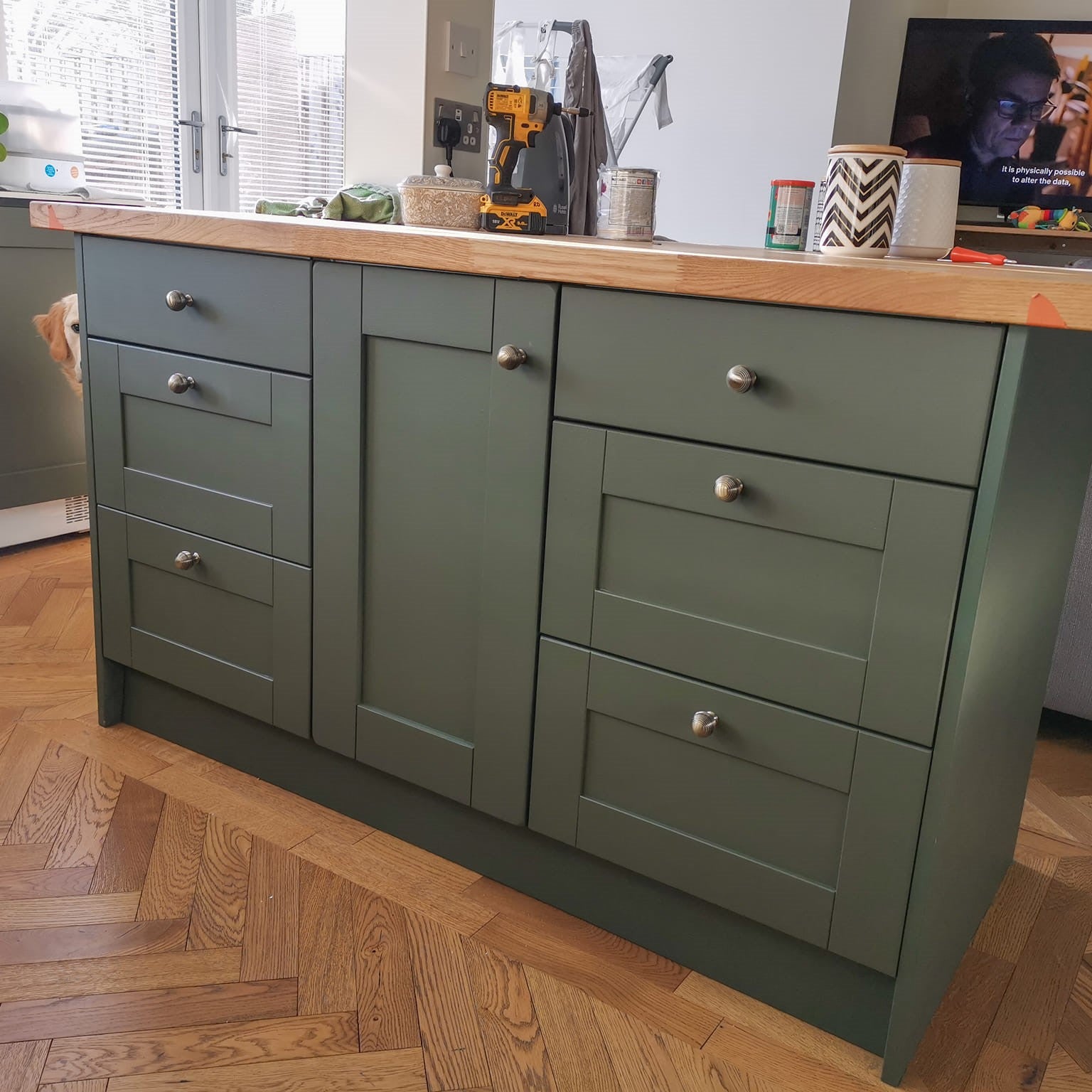
Don't underestimate the magic power of furniture recycling – the hidden treasure of the interior design world is Frenchic!
Recycled furniture and DIY projects are like golden nuggets in the world of interior design – easily forgotten but incredibly valuable.
Who would have believed that a bookshelf abandoned by the neighbor could become the heart of your living room?
And the joy of painting! Every brushstroke is like a small revolution – the former gray and nondescript dresser comes to life, becoming a personal design element.
We remind you to take important before and after photos – they are the best memories of change – we want to see your golden nuggets of interior design.
If you thought a DIY project was just tinkering, think again!
This is your chance to make your interior art, where every piece of furniture and space is a story in itself.

The shade in this picture is similar to Earthy.
Paint your world colorful – Colors are the wonderful spice of life
When you open the door to a strong terracotta-colored hallway, what do you feel?
Maybe warmth, coziness, and a faintly spicy heat that reminds you of fresh spice bundles in the narrow alleys of the bazaar. Spicy colors are not just an interior trend – they are a way to bring the richness of cultures and the depth of stories into your home.
Orange terracotta on the walls feels like a soft hug. Guests might notice their breath deepening and their shoulders relaxing right in the entrance. This color doesn’t shout for attention but invites calm.
Maybe it reminds them of an afternoon on the Tuscan hills, or simply how good it feels to be welcomed.
A guest stepping into a burnt brick-colored entrance feels as if transported momentarily to another world. Strong colors combine with strong scent memories – they complement the story of colors: cardamom, clove, and cinnamon float in the air like the steam of warm tea and cinnamon rolls.
Such an entrance hall doesn’t just welcome you – it immediately wraps you in its embrace.
Why choose spicy colors?
They are timeless – Spicy colors don’t follow trends – they are rooted in history and cultures.
That genuine warmth. Spicy shades bring a welcoming and earthy atmosphere to a space and are easy to combine.
Spicy shades suit both modern Scandinavian style and bohemian interiors equally well.
Painting is not just decoration – it’s an experience, like a theme park ride on a rollercoaster of colors!
You can completely change the atmosphere of your home with one bold shade.
Just think: what’s the difference between the neutral light *Cream Dream* and the bold, deep-toned *Ducky*? With one, you create classic harmony; with the other, you bring the space to life!
Every piece of furniture offers an opportunity to tell a story. What if your table were like a map of past adventures or your side table shone like the horizon at sunset?
Painting furniture is not just about the surface – it's like a fireworks display in the world of colors! Besides saving money by doing it yourself, you can also save this planet.

The shade in this picture is similar to Cream Dream or Creme de la Creme. As a lighter option, whipped cream white, the soft Wedding Cake shade.
When white is too cold and gray no longer fits – next time you look for a color that combines elegance and coziness, choose cream or light beige.
It's like a skillfully made soufflé: airy, unobtrusively luxurious, and sure to please everyone. The perfect old white is the Yorkshire Rose shade, with a hint of pink.
The soft cream shade is not just a color – it's a state of mind. It tells that life in this home is balanced, your home is warm and approachable. Cream-colored walls don't just frame your home; they provide a soft, timeless backdrop where both everyday moments and festive gatherings can shine.
A cream-colored light room conveys subtlety.
It doesn't boast, but it offers a touch of luxury, as if you had stepped into a classic European café where tables are set with white tablecloths and paintings bathe in soft light on the walls. Guests immediately feel welcome, as if they had just been handed tea in porcelain cups.
Your style can be from anywhere in the world, cream shade always works!
The cream shade combined with dark wooden beams and brass details evokes the scent of a toasted croissant and strong espresso. Imagine a French bistro.
And how about this: Soft cream shades combine with antique furniture and lavender pots flourishing on windowsills along with those pelargoniums. Just like a sweet English countryside home. Also combine cream shades with other pastel tones in this style; like the powdery pink Dusky Blush, sage green Wise Old Sage, and delicate lavender Parma Violet.
Is your style even further away? For the minimalist Japandi style, the perfect cream shade highlights the harmony of natural light and bamboo surfaces. Pair it suitably with the structured matte black Blackjack and your space is ready.
With colors, you can paint not only the furniture but also the entire room’s atmosphere and style.
Whether it’s a charming vintage bookshelf, an old Ikea piece, or an adventurous retro side table, every piece of furniture is like the melody of a lyrical song, shading your interior to a new level.
Using colors doesn’t just shape the furniture – it creates an entire universe around you.
And hey, who wouldn’t want to live in a universe where the sofa and walls speak the same language as the curtains?

The shade in this picture is similar to Ducky.
Into the jungle of color theory – Learn to be Color Bold!
Is there a better feeling than when you find just the right shade that touches your heart?
A little tip: you usually find it when you dare to play and experiment.

The shade in this picture is similar to Ducky or Ol' Blue Eyes.
Color theory may sound complicated, but really it’s like an interior designer’s secret treasure chest.
The color wheel is like a compass guiding you towards the perfect balance of harmony and contrast.
It's a bit like cooking – with the right combinations you create a delicious whole, and with the wrong color combinations you get… well, chaos. But sometimes chaos is beautiful, isn’t it?
Try contrasts!
*Ol’ Blue Eyes* blue shade can beautifully combine with warm yellow tones to create a charming and energetic atmosphere. Or if you want harmony and calm, pair adjacent shades like *Pinky* and *Ballerina*.
Step into the deepest depths of the color theory jungle, where every color is like a spark of adventure!
Color theory is not just a wild jungle, but also a colorful roadmap guiding you towards the treasure chamber of interior design.
What is the red thread of your interior?
Pastel shades, green plants, modern black and white, or something else? Explore the colors on our pages and you can easily combine shades that fit and highlight the red thread of your interior.
Start by reading about the history of colors in our Knowledge Base.

The shade in this picture is similar to Eye Candy or Apple Barn.
When you choose pastel green for your kitchen, you not only decorate but bring timeless freshness and life to the space.
This light green shade doesn't demand attention, but still steals it beautifully. The color makes your morning coffee moment fresh, dinner preparation serene, and every moment in your kitchen a little more harmonious.
The energy of a pastel green kitchen is light and delicate, yet refreshing at the same time. Your guests will feel as if they are stepping into a kitchen that always smells of fresh basil, with a freshly baked lemon cake waiting on the table. The green shade brings the idea of freshness, whether it's dill chopped on your breakfast bread or a freshly sliced lime for a margarita.
Pastel green is like spring that never ends – and what better place for this color than the kitchen where life happens?
If you're wondering how to combine these shades with each other, take hold of the color wheel, the adventurer's best companion and the compass of interior design!
This easy-to-use tool helps you explore the jungle of colors and find the best combinations. You can also use the color wheel when choosing wallpapers and curtains – or clothes! The best benefit of the color wheel is if you are planning to redesign the color scheme of spaces or even your entire home.
Cotton candy pink kitchen – the sweet cornerstone of your home
This shade makes your kitchen more than just a space – it creates an experience. It combines lightness and joy in a way that never feels exaggerated. Your pink kitchen is not just a place for cooking; it's a space where life tastes a little sweeter and every ordinary moment becomes special.
If you want to bring a touch of happiness to your home and dare to try something different: a pink kitchen for an adult taste is the perfect choice. It's like a piece of sweet and sticky cotton candy: light, tempting, and just boldly enough. Your shade could be the powdery Dusky Blush.

The shade in this picture is similar to Pinky or Ballerina.
How does it feel to step into a sweet pink kitchen in the morning?
Right at the door, you encounter a pink shade that brings smiles and reminds you of life's simple joys. Pastel pink is not just a color – it's an attitude: playful, charming, and surprisingly sophisticated at the same time. This shade is like a sweet moment melted into the kitchen, brightening both everyday life and celebrations.
A pink kitchen might sound like a bold choice, but the cotton candy pink shade is the perfect blend of softness and personality. It brings playfulness, warmth, and surprising elegance to the space!
- Cotton candy pink reminds of childhood candy stores and birthday cake marshmallows.
- Pink creates a cozy and inviting atmosphere that makes the kitchen a relaxed meeting place.
- Combined with the right materials, such as brass or marble, pink can even be luxurious. Or rather, it is.
A pastel, just-right pink kitchen immediately evokes a feeling of lightness and joy
Imagine how your morning starts in such a kitchen: a cup of coffee gleams against softly pink walls, and the space feels inviting for dreaming. Guests, on the other hand, cannot help but feel welcome
Although pink may at first glance seem sugary sweet, it is intertwined with many cultures and moods:
- French charm: Imagine a small kitchen in the heart of Paris, where sweetly worn pink vintage cabinets combine with white tiled walls and old-fashioned cast iron pans. Your vintage pink shade is Rosy Dusk.
- American retro diner: Bubblegum pink color charms alongside metallic bar stools and mint green details. Your shade is sweet BonBon.
- Japanese kawaii aesthetics: Pink shade combines with minimalist lines and natural materials, creating a stylish yet cute whole. Your shade is delicate Ballerina, Sweetcheeks, or Pinky.
Pink is not just a color – it's also a taste, a scent, and a feeling. In the kitchen, it evokes the foam of a strawberry milkshake sparkling on the glass edges, a freshly baked macaron whose filling melts in your mouth, or a festive raspberry cake that brings a smile to every eater's lips.
The secret weapons of painting maestros – With these tips, you conjure magic!
It's time to bring out the master's tools and master the secrets of painting projects. First of all, don't underestimate the power of contrast colors, even if you're decorating "just" with gray.
Imagine a Hot Lips red or electric blue Kiss Me Slowly stripe highlighting the edges of your light dresser – suddenly it becomes the real conversation piece of the room. Who wouldn't want a piece of furniture that makes guests exclaim: "Where is this from?!"
You can read more about the power of red in our Knowledge Bank.

The shade in this picture is similar to City Slicker.
Stylish light suit gray in a paneled hallway – elegance and timelessness at the first step
The first feeling is like stepping straight into the pages of a manor novel: calm, dignified, and perfectly controlled. Light gray is a shade that not only welcomes but makes every entrance impressive.
Bring a subtle mix of gray, white, and a hint of beige warmth – it's a perfectly balanced shade. It doesn't dominate the space but lets it breathe, creating a pleasant and sophisticated atmosphere. Alongside paneling, it achieves a classic and luxurious look that fits equally well in a modern city home or a rural idyllic courtyard.
Light gray in the hallway is timeless and exudes confidence – it doesn't need attention, but still gathers it. In such a hallway, you always feel like a valued guest. You could be in an English manor or a Scandinavian home, it works in both!
Imagine soft wool accessories in your hallway, scarves and hats in shades of gray and white that complement your soft color palette. Tile or herringbone parquet that repeats the gray tones and adds texture to your hallway. Brass or black hooks, light switches, and door handles that bring subtle style to your space.
Gray is a shade that tells about its owner: classic, precise, and just the right amount of personality. The light gray in your paneled hallway is not just color and shape – it's a story of polished everyday life and how small details make a big impression. It's a space that gives your home a strong and stylish first impression while inviting you to step further inside.
If you're looking for a combination in the hallway that blends dignity and practicality, the light City Slicker shade is the perfect choice. It's like a classic, well-tailored suit: it always looks good and feels even better.
Atmosphere is created only with colors
If you want energy and drama, choose bold shades like fiery **Hot Lips**. If you seek peace and balance, let the calm of **Crystal Blue** settle into the room.
You can play with colors like a painter creating a sky landscape – each layer adds a new dimension.
Use contrasting colors to highlight the unique features of your furniture. Whether it's a bold chair or a shy side table, contrasting colors bring out the true character of even the most modest piece.

The shade in this picture is similar to Nougat.
Mood mastery: Colors have immense power to create atmosphere.
Warm colors, like bold reds, give the room energy and life, while cool shades, like calming blues, create a peaceful atmosphere. Learn more about colors and their history in our Knowledge Bank.
So think about the kind of atmosphere you want in the space and choose a color based on that energy.

The shade in this picture is similar to Crystal Blue.
And then there’s the most important tip of all: dare!
Boldness in color choices is the secret that separates "just nice" furniture from true works of art.
Why settle for ordinary when you can make your furniture something that makes your heart sing?
*Plum Pudding* or *Kiss Me Sloely* are not just colors – they are attitudes! Statement pieces deserve statement colors.
Read how you can decorate with colors more easily.

The shade in this picture is similar to Victory Lane mix Whitey White.
The painting adventure begins – Boldly diving into color!
It’s time to start an adventure that takes you into the depths of color and creativity. Painting is not just crafting – it’s self-expression, an exploration, and a little revolution all in one.
When you pick up the brush, you also take control of the chance to change your environment and your life. Nothing beats the feeling when you notice how the furniture comes to life and the room gains a whole new spirit!
Start your project by dreaming – what kind of atmosphere do you want to create?
Maybe it’s a serene oasis inviting relaxation, or a bold and wild space radiating personality. Color can be rock or chic. Colors are the key to making a home more than just a place – it can be a whole experience.

The shade in this picture is similar to Bon Bon.
Inspiration for any space – A Home Full of Stories
Your kitchen is the heart of the home, so why shouldn’t its colors pulse with life? Pastel blue shades like *Duckling* or *Little Duckle* bring classic charm and calm energy to the space.
The hallway is the first impression of your home, so give it a worthy shade! Bold *Ol’ Blue Eyes* or soft and suitably romantic *Sweetcheeks* make the space both inviting and unforgettable.
Paneling, moldings, slats, and other details are like the cherry on top of the decor. Try shades like *Yorkshire Rose* or the dark and dramatic *Smudge*. With these small touches, you can completely transform your room – and maybe even spark a little envy in your guests!
Get ready to dive into the world of colors and paint your own mood!
Painting furniture is not just a pastime; it's an opportunity to express your personality and create a unique home where each piece of furniture tells its own story.
What if you next tackled the color scheme of your garden, terrace, or balcony?

The shade in this picture is similar to Ol' Blue Eyes.
Be brave, be creative, and above all, enjoy the flow feeling that painting creates – break away from everyday life! Paint your world colorful and give your interior a new life!

The shade in this picture is similar to Hot Lips.
Whether you're outside, on your balcony, or in the garden – or inside – colors create the atmosphere of the space
Japanese garden, colorful English cottage garden style, or a campfire spot by the cottage shore or an archipelago sauna.
Use colors boldly to create amazing atmospheres and dare to make changes when life and mind change!
Decorating outdoors or indoors: 5 interesting interior styles.

The shade in this picture is similar to Irish Dance.
Painting is an easy, quick, and cost-effective way to change the atmosphere of your environment to something new or make an old surface beautiful again
Get inspired with us, and if you haven't tried the Frenchic series paints yet, start by getting a 250ml small test jar, with which you can change the color of, for example, an interior door, a small cabinet or dresser, a couple of chairs, or a narrow wall!

The shade in this picture is similar to Santorini.
Everything starts with preparation
The painting adventure begins with careful preparation. No, now we're not just talking about applying painter's tape (although that's important!).
First, think about what you want your furniture or space to express. Is your space like a quiet poet or a bit of a wild adventurer? Let your furniture or space speak for itself, and choose shades that bring out its personality.
And then, take a moment to clean and sand the surfaces. This small effort ensures the result looks like it's straight out of an interior design magazine.
You will surely fall in love with our series' stunning and stylish matte shades – and their ease of use.
Once the preparatory work is done, you can focus on what matters – the color frenzy that sweeps you away!
Be ready to receive compliments!

The shade in this picture is similar to the classic English shade Duckling. Other pastel blues include, for example, Little Duckle.
Courage is the painter's best companion
Courage doesn't just mean bright shades – it means daring to try, fail, and discover something new.
If you’ve never painted a cabinet bright red, like Hot Lips, now is the time.
Boring solutions belong to yesterday!
Life is too short for paper-white walls or muted beiges (unless beige is your heart’s shade, then it’s perfect).
Remember: every color also chooses the story of the space. Maybe you want to boldly paint the kitchen dining table blue, like the summery sky *Ol’ Blue Eyes* shade, or perhaps you conjure a romantic, soft, and gentle *Yorkshire Rose* from your dresser.
You decide!

The shade in this picture is similar to the sky blue Ol' Blue Eyes.

The shade in this picture is similar to Sweetcheeks.
Layer by layer – the result is like a work of art
When the first coat covers the surface, don’t get discouraged yet. It often looks like your furniture just woke up from a nap. With the second and third coats, you’ll see the magic begin.
Paint is not just color – it’s a characterful surface that turns furniture into a masterpiece.
If you want to add personality, try layering shades – combine, clash, and match!
Also try playing with gloss levels – a combination of matte and glossy can be stunningly beautiful!
Same same but different
Below are two pictures of the hallway. Both have a unique atmosphere created by the color. Which one is your choice?

The shade in this picture is similar to Yorkshire Rose or Whitey White.

The shade in this picture is similar to Stirling or Victory Lane.
Interior professional's pro tip: white moldings are now completely passé
Now we paint the walls and moldings in the same shade. The boldest also paint that fifth wall, the ceiling, creating a brick-style and luxurious vibe overhead!
If this idea feels too bold but still interesting, try it first in a smaller space, like a small bathroom or bedroom. What if you wallpapered the ceiling and painted the walls and moldings?
Even if you are a beginner or have painted less, you will probably fall in love with the new features of our paints – they are easy to use and safe to start being Color Bold! You can read others' painting experiences here.

The shade in this picture is similar to Smudge or Blackjack.
Surfaces, patterns, and textures – Dare to play
If a solid color surface feels too simple, add patterns or texture. Imagine a dresser combining the matte Smudge and golden metallic shine! Use stencils to create geometric patterns, or casually freehand curved lines or tape sharp stripes on the wall or furniture! We have listed various painting techniques here as a handy list, see if you learn something new!
Texture painting is another way to create interest. For example, with a thicker layer of paint, you can create striking ridges that add depth to the surface. Try Saltwash texture powder with paint for this technique. This technique works especially well with natural shades like Pampas or Stone in Love.
If you love a smooth and flawless painted surface, Frenchic is the perfect paint series for you – the paint that levels beautifully!

The shade in this picture is similar to Yorkshire Rose or Parchment
The story of furniture and space lives through its colors
Every painting project is a story – not just of the furniture, but also of you. Maybe that old cabinet now tells with its new color how the power of change can bring new life. How nice it is to brush past that painted, beautiful dresser!
And that door – the freshly painted green vestibule door delights anyone coming home and brings a smile to their lips. A guaranteed conversation starter and a subject of compliments among guests.
By the way, you can paint a door from just one side - how about a stunning electric blue guest WC door? Bold shades like Irish Dance make the furniture a dancing star and bring a smile. On the other hand, the calm Creme de la Creme can be like a quiet poem that brings harmony to the room.
Which one are you today – a dancer or a poet?

The shade in this picture is similar to Beach Hut.
Big impact with small touches
If painting the entire piece of furniture feels like too big a project, start small. For example, paint just the drawer fronts or the legs of the furniture. Imagine how a bold shade like the berry porridge red Love Letter highlights the details of an otherwise neutral piece.
Small touches can make a big impact!
Let your furniture shine
Remember that painting is only part of the project. Finishing is the moment when the furniture steps into the spotlight.
Add beautiful handles, such as metal or porcelain details, and watch how your furniture transforms into a work of art.
Also pay attention to lighting – the right lighting can make the painted surface lively and beautiful. And you can always add one more houseplant!

The shade in this picture is similar to Stone in Love.
Painting is therapy.
Despite all the beautiful results, painting is also a process that gives a lot to its creator..
Brush strokes and the smell of paint can be like meditation. Detach from everyday life and allow yourself to immerse in a flow state where only colors and creativity are present.
Handmade or recycled - you will enjoy the result in your everyday life for a long time.

The shade in this picture is similar to Pampas.
Get inspired and dream - share joy!
Immerse yourself in others' amazing projects, admire beautiful and everyday pictures and photo series from ordinary people's homes, take inspiration, copy, or implement even better yourself.
Choose the best, most suitable color combinations and renovation implementations for you. Read others' experiences from project planning and execution - ask the creator yourself!
The best and most reliable opinion comes from experience - not imagination.
Wherever you are, you can interact with other skilled creators in our active FB group or on Instagram.
Like, comment - bring your coworkers and neighbors along.
Tell your constructive and renovating friend about us!

The shade in this picture is similar to Pinky.
We give space to bold home dreams!
The images in this article are AI-generated, so the color suggestions are indicative.