

A symphony of shades!
One of the funnest and most inspiring things in a painting project is to try combinations of different shades side by side, and to mix your own shades.
Sometimes the idea starts from the fact that there is a vision of the end result. For example, in the jätskikorviks of our own product line, the goal is to get a shade that matches as closely as possible the color of e.g. strawberry ice cream, chocolate ice cream or even orange juice ice cream.

Orange juice ice cream:
- 5/10 Mcfee, Al Fresco
- 3/10 Hot Mustard, Lazy Range
- 2/10 Dazzle me, Al Fresco
Strawberry ice cream:
- 7/10 Dusky Blush
- 3/10 Dazzle us
Chocolate ice cream:
- Pickle, Al Fresco
- A "sprinkle" of Spitfire and Dazzle me to offset the redness.
The surprise comes from the rest of the paint can
Sometimes, if there is only a little paint left in a few cans, it's interesting to try what the end result is when you mix them.
This is how e.g. the shade with which I have painted both a coffee table, a rocking chair and a small cabinet in my own home.
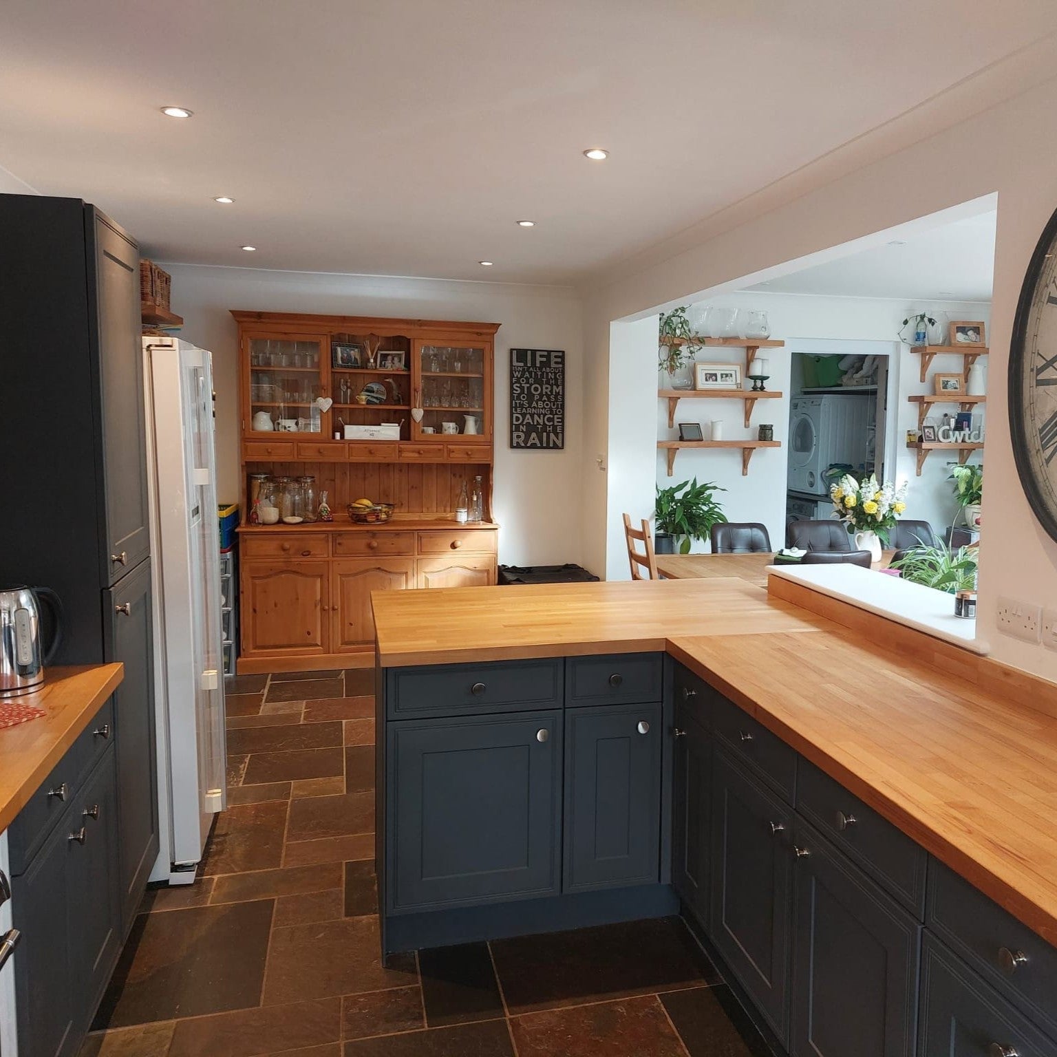
I combined the bottoms of Blackjack, Salt of the Earth and Steel Teal jars and the end result was quite nice. If you feel that the end result didn't hit the button all at once, you can always add shades until you like the end result. When mixing, you quickly develop a feeling for how each shade behaves with another shade. Of course, there is always a touch of surprise in new combinations, and that's a pretty ticklish feeling.

The tone of the table and cabinet is mixed from the following tones:
- Steel Teal, Al Fresco
- Blackjack, Al Fresco
- Salt of the Earth, Lazy Range
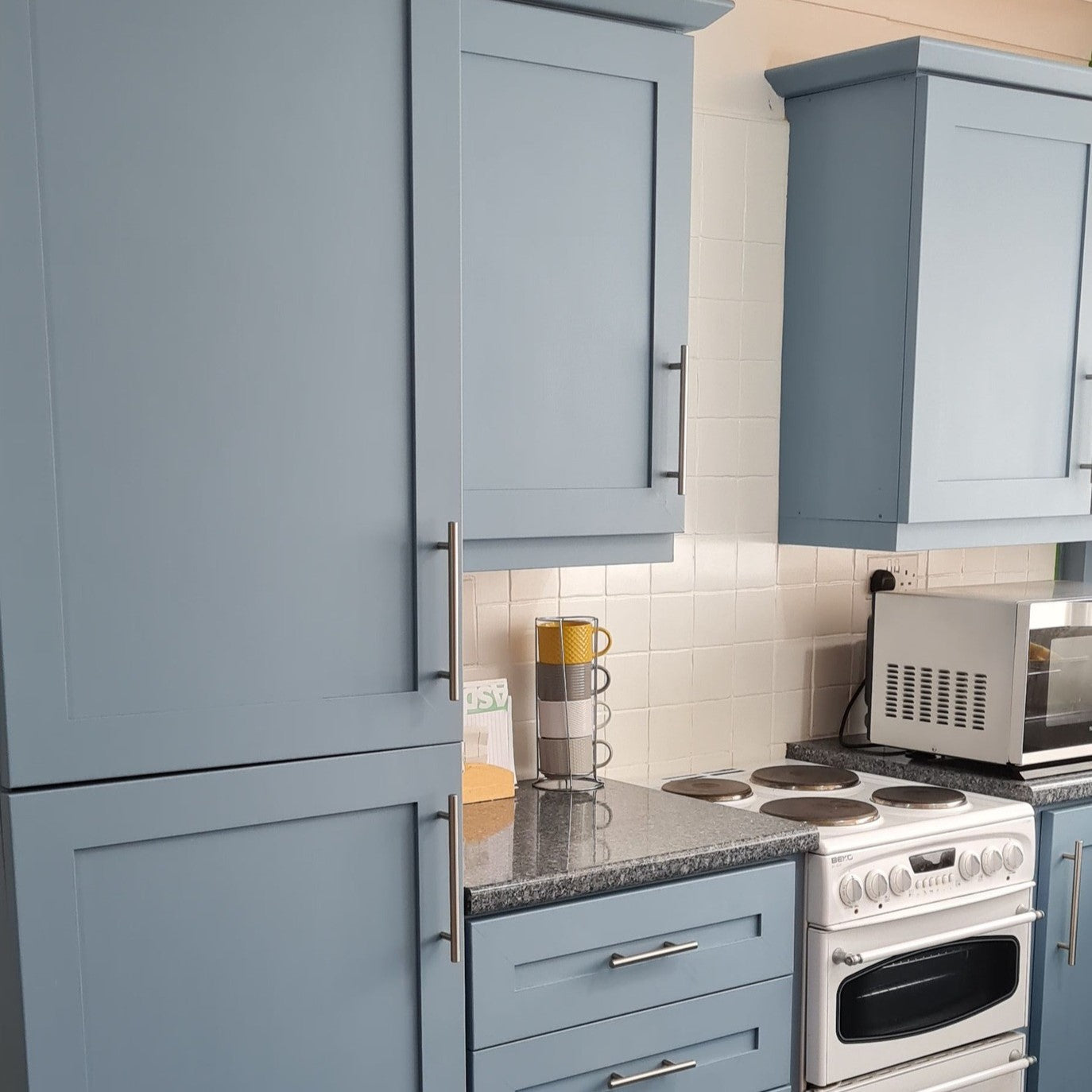
Standard shades are always found on the shelf of a diligent painter
There are quite a few cans of paint on the shelf of your home. I always make sure that there is a jar of white shade, e.g. Dazzle Me from the Al Fresco series or Whitey White from the Lazy Range series.
In addition, there are usually a couple of shades of gray that can make the already beautiful soft shade a little more "foggy". For example, City Slicker from the Al Fresco series works well for this. All Frenchic paints can be mixed together.
However, remember that different paint series have slightly different properties. In the case of self-made shade mixing, e.g. durability should always be considered based on the series with the least protective substances. If you decide to mix, for example, paint from the Al Fresco series with paint from the Original Artisan series, you should protect the surface with e.g. wax or a finishing coating.
The following picture shows painted plywood squares, where the goal was to get fresh summer color combinations. The Sweetcheeks shade in the upper left corner is the original shade, but the others are self-mixed.

Green:
- Constance Moss, Al Fresco
- City Slicker, Al Fresco
- Whiter than White, Trim Paint
Lilac:
- 9/10 Parma Violet, Al Fresco
- 1/10 Plum Pudding, Lazy Range
Yellow:
- 8/10 Hot as Mustard, Lazy Range
- 2/10 Whitey White, Lazy Range
Pink:
- Sweetcheeks, Wall Paint
The secret of turquoise
On the other hand, in this picture you can find a wonderful sparkly turquoise.

Turquoise:
- 5/10 Dazzle me, Al Fresco
- 2.5/10 Steel Teal, Al Fresco
- 2.5/10 Victory Lane, Al Fresco
In the picture, the shades Swanky Pants, Al Fresco and Sweetcheeks, Wall Paint are also on the upper edge of the plywood sheets.
Finally, a couple of tips if you decide to mix your own shades
If, for example, you are painting a piece of furniture that is subject to heavy wear, you should reserve enough paint that you can save the rest for possible repairs. Remember to close the jar carefully.
In addition, you should always write down the names and amounts of the shades so that you can mix more of the same shade if necessary. By the way, this is the one that you sometimes forget. No one is told that our rocking chair and coffee table are not exactly the same color, even though it was meant to be.
Feel free to mix your own shades and it would be really nice if you also share the end result with us on social media, for example on Facebook in Frenchic's Inspirational painting group.
Minteri Design operates in Kouvola as a Frenchic dealer. The selection of the boutique we run together with another entrepreneur includes various interior and gift items and jewelry as well as Frenchic paints.
All products from Minteri Design's own product line as well as the recycled recycled products on sale are painted with high-quality Frenchic paints. When it comes to shades and various shade combinations, the only limit is your imagination.
Great painting moments for all of you!
Anni, Minteri Design