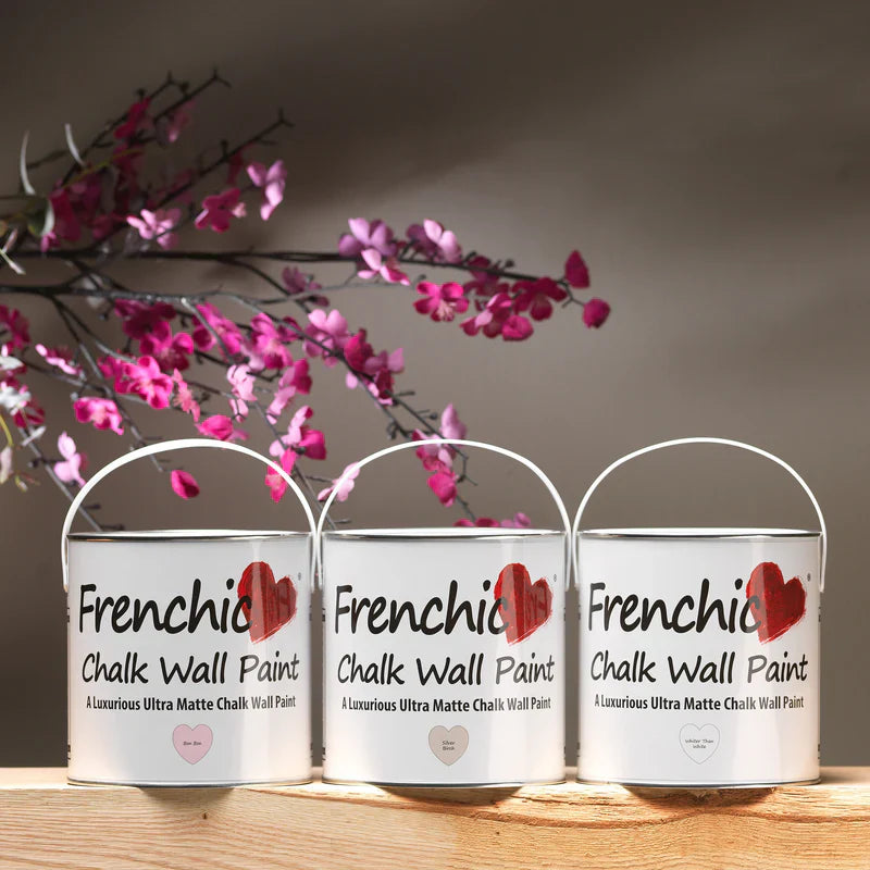
With the double-sided and large color wheel (diameter approx. 24cm), you can find perfect color pairs and new unique paint mixes for your home's color scheme or even for designing color combinations for clothes and art.
A color wheel is a simple device that shows how colors behave when you add black, white, or a completely different shade. By turning the parts of the wheel, you can see combinations of different shades.
In other words, it quickly shows you which colors go well together and lets you see which colors are complementary or shade pairs.
The double-sided color wheel, diameter approx. 24cm, is versatile and easy to use.
The text on the color wheel is in English.
Read more on the tab.
The color wheel disc has 12 segments - parts, each representing one color. The wheel shows how colors relate to each other, whether they are next to each other or diametrically opposite.
The double-sided color wheel includes three primary colors: red, yellow, and blue, as well as three secondary colors: green, orange, and violet (when two primary colors are mixed, they form a secondary color).
The color wheel also has six tertiary colors, which are mixtures of primary and secondary colors. These are red-orange, yellow-orange, yellow-green, blue-green, blue-violet, and red-violet.
Warm colors - reds, yellows, and pinks - are on one side. Cooler shades - blues, greens, and violets - are on the opposite side of the wheel.
Choose a color, for example green – then turn the inner wheel of the color wheel to see what it looks like when you add red to the green you chose. Turn more and see what green looks like when you add yellow, and so on.
Turn the color wheel and examine the green color. Align the inner disc of the wheel with green, and you will see three shades of green in the inner disc view: Shade, Tone, and Tint – marked accordingly.
Shade: your chosen color + white
Tone: your chosen color + gray
Tint: your chosen color + black
Our Frenchic customers have skillfully mixed their own unique shades, which you can find in the FB group by searching for COLOR RECIPE. Join the group here!
How to create effective color combinations for home decor using the color wheel?
Using the color wheel to build a color scheme also requires understanding different types of color schemes for home decor ideas. Examine shades with the color wheel, together with color theory, without forgetting your own preferences.
The color wheel is just your helper, but trust your own opinion and use shades you like. However, the color wheel can be very practical, whether you are planning large projects or considering making one beautiful shade mix.
Mixing colors is fun, and by mixing your own shades, you can find completely unique and personal colors to use!
A diligent shade mixer and painter always keeps white and black paint on the shelf, because with them you can mix countless shade combinations that still look beautiful together – a great tip for renovation and interior painters!
Monochromatic color schemes
Monochromatic color schemes create a harmonious, calm atmosphere, which is currently very trendy in interior painting. Right now, it is trendy to paint ceilings and moldings in the same or almost the same shade as the walls.
You can choose one main color, for example blue, and use different degrees of blue on surfaces and in decor, from very light to bright, greenish-blue, and navy blue depending on the room and desired mood.
Complementary colors for the bold
In a contrast color scheme, two colors from opposite sides of the color wheel are used. For example, what would orange and blue look like together – you can also use this trick on a small scale – for example: paint a wall blue and use an orange lamp in front of the blue wall in the decor. Complementary colors are also pleasing to the eye.
Which colors go well together in interior design?
If you follow the color wheel, you will find a wide range of shade options to choose from. Some of these combinations may already be familiar to you, while others you may not have encountered before.
Here are some successful combinations worth considering:
Play with shades and shade intensities
A good tip is to use different saturation levels of a color. We recommend using a lighter shade of one color and a darker shade of another. For example: green and pink.
Use darker green and light pink together – a guaranteed working pair! This combination also suits raspberry red and fuchsia as accents. Finish the space with a light blue floor. Do you notice that this sure-fire combination looks like it’s straight from nature!
Green is currently popular in interior design. You can naturally combine green with all natural shades: blue, brown, terracotta, beige, and black – and their various degrees of variation.
Think of the sky – sea and earth. With these shades, you can create a cozy and naturally calm background for the rest of your home decor.
In natural shades, you can be bold – try water shades, deep forest green, and fresh sky blue.
Combine green with a soft cream shade instead of white if you want soft tones.
What pairs well with gray?
Gray is still popular in interior design; you can choose pairs for gray from lively terracotta, blues, and various reds. Spicy shades of brown and yellow also go well with gray.
Now that you have a bit more information on how to use the double-sided color wheel and how to mix colors, you will surely get inspired to create your own perfect palettes!
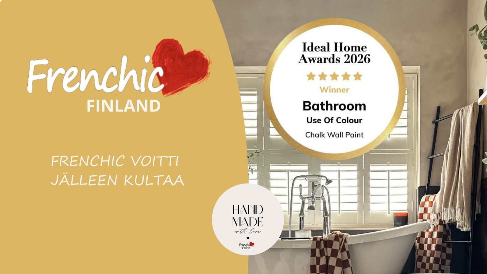

Vuoden 2026 palkinnot osoittavat jälleen, että laadukas maali voi tehdä kodin uudistamisesta helpompaa, kestävämpää ja ennen kaikkea värikkäämpää.
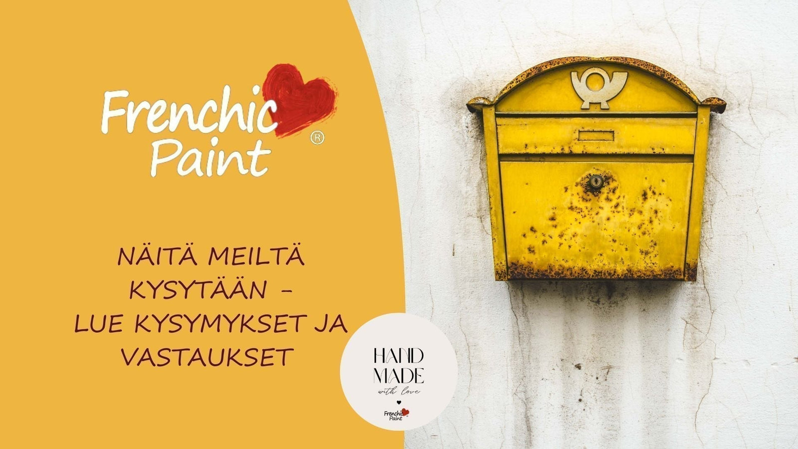

Olemme koonneet tähän yleisimpiä usein kysyttyjä kysymyksiä (UKK) ja vastauksia Frenchic maaleista. Päivitämme sivua säännöllisesti, joten tätä sivua kannattaa seurata.
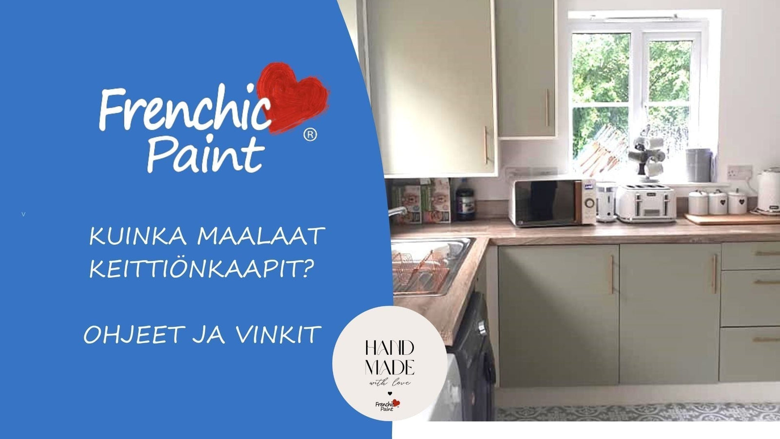

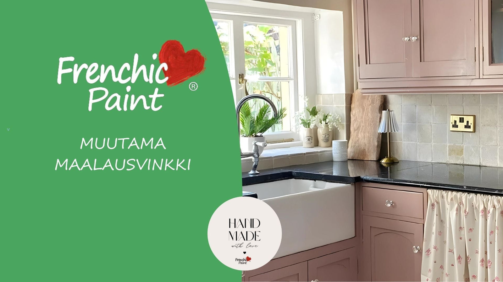
Haaveiletko uuden näköisestä keittiöstä ilman suurta remonttia? Keittiön kaappien maalaus on nopea ja edullinen tapa uudistaa keittiö. Lue vinkit onnistuneeseen projektiin ja oikean maalin valintaan.

Kun aloitat projektin, valmistele kaluste maalauskuntoon. Ota tarvikeet esille ja suojaa kalusteen ympäristö.